Documentation :
(v.1.0.0)
WS-LiSli is a Lightbox Slider jQuery plugin created by Alexandre Buleté. Here is the premium version, if you want to access at the free version go here : free version.
The premium version have a lot of additional functionalities like a selector bar, a zoom panning, sharing buttons your media on social networks etc…
You can also place all buttons and functionalities where you want.
Pricing
19.99 €
To access of this premium version please contact me : alexandre.bulete@walkerspider.com
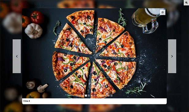
Demo
Getting Started
To use WS-LiSli Premium plugin in your project you have to import jquery and jquery-ui scripts
<script src="https://code.jquery.com/jquery-3.3.1.min.js" integrity="sha256-FgpCb/KJQlLNfOu91ta32o/NMZxltwRo8QtmkMRdAu8=" crossorigin="anonymous"></script>
<script src="https://code.jquery.com/ui/1.12.1/jquery-ui.min.js"></script>
After this you can add the WS-LiSli script in your footer like this :
$(function() {
    $('#my-lightbox').WS_lightbox({
        // add your custom options here
    }
}
Options
Enable elements
You can enable any elements you need by using the enable array.
// example :
enable : [
    'share',
    'arrows',
    // 'dots',
    // 'playback',
    // 'zoom',
    'close',
    'caption',
    'selector',
    'wrapper',
    'count'
]
You can also enable the caption elements needed with the caption array
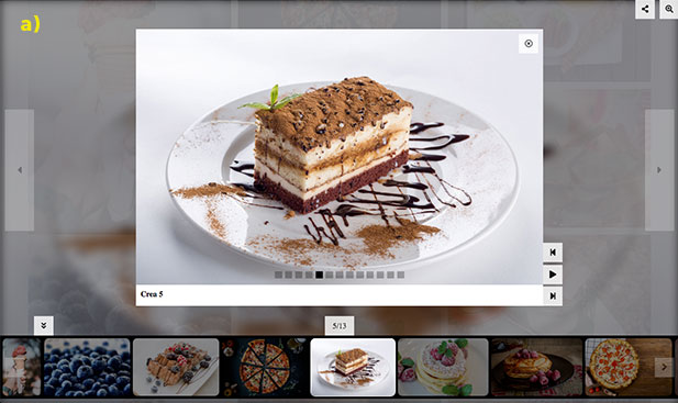
caption : ['title', 'description']// example a)
enable : [
'share',
'arrows',
// 'dots',
// 'playback',
// 'zoom',
'close',
'caption',
// 'selector',
// 'wrapper',
// 'count'
],
caption : ['title', 'description']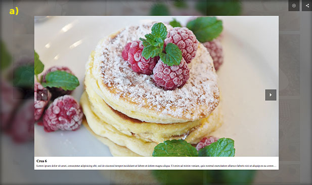
// example b)
enable : [
    'share',
    'arrows',
    'dots',
    'playback',
    'zoom',
    'close',
    'caption',
    'selector',
    'wrapper',
    'count'
],
caption : ['title'],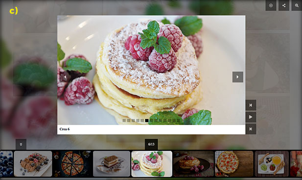
| enable (Array) | |
'share' | Display the share button |
'arrows' | Display the slider arrows |
'dots' | Display the slider dots |
'playback' | Display the playback buttons (play/pause, first and last) |
'zoom' | Display the zoom-paning button |
'close' | Display the close button to exit the lightbox (to exit the lightbox without this button you can use the escape keyboard) |
'caption' | Display the image’s caption (title and description) |
'selector' | Display the images selector banner |
'wrapper' | Display the wrapper selector button (to hide/show the images selector banner) |
'count' | Display the count images which show the image position and total images (example : 4/6). |
| caption (Array) | |
'title' | Display the picture’s title |
'desription' | Display the picture’s description |
Positioning
Element positions
Positioning of all elements can be customized with the pos_{element} options. They are arrays contening 2 strings.
- the first for positioning in space (
'top_right','top_left','bottom_right','bottom_left') - the second for positioning relatively to the lightbox image (
'outside','inside','attached-X'ou'attached-Y').
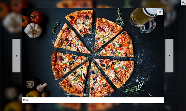
// example a) :
pos_shareButton       : [ 'top_right' , 'outside'],
pos_zoomButton        : [ 'top_right', 'outside'],
pos_wrapperButton     : [ 'bottom_left', 'outside'],
pos_playbackButton    : [ 'bottom_right', 'attached-X'],
pos_selector          : [ 'bottom', 'outside'],
pos_closeButton       : [ 'top_right', 'outside']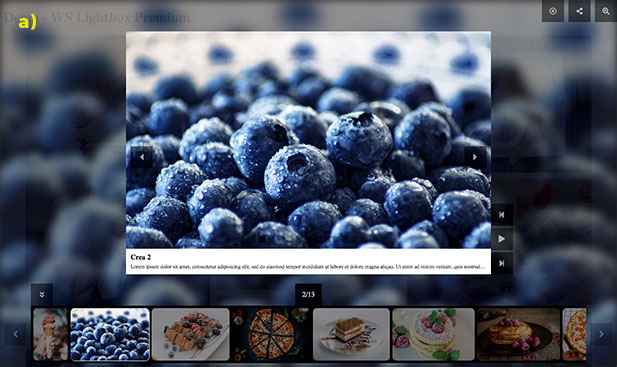
// example b) :
pos_shareButton       : [ 'top_right' , 'inside'],
pos_zoomButton        : [ 'top_right', 'inside'],
pos_wrapperButton     : [ 'bottom_right', 'outside'],
pos_playbackButton    : [ 'bottom_right', 'inside'],
pos_selector          : [ 'right', 'outside'],
pos_closeButton       : [ 'top_right', 'inside'],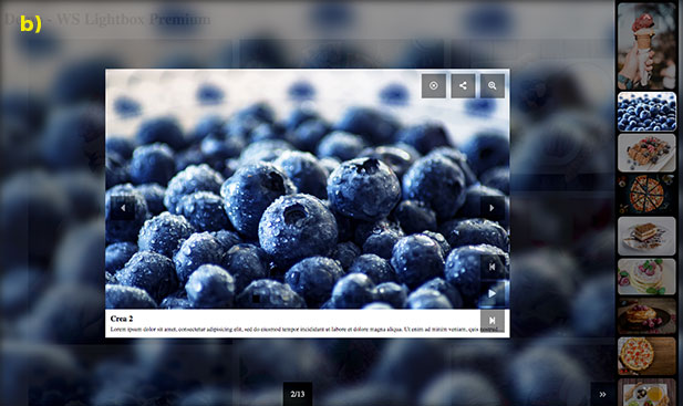
| Option name | Type | Description | Default value |
pos_closeButton | Array | the close button to exit the lightbox | ['top_right' , 'outside'] |
pos_zoomButton | Array | the zoom buton for the zoom-paning mode | ['top_right', 'inside'] |
pos_wrapperButton | Array | the wrapper button to close/open the images selector banner. His second parameter can only be ‘outside’. | ['bottom_right', 'outside'] |
pos_playbackButton | Array | the playback buttons (play, stop, first, last) | ['top_center', 'attached-X'] |
pos_selector | Array | the images selector banner can only be positioned on the ‘bottom’ or on the ‘right’ and ‘outside’ | ['bottom', 'outside'] |
pos_shareButton | Array | the sharing button display in hover the differents social networks. | ['top_left' , 'attached-X'] |
Box Positions
Each possible spots are structured with boxes to accept multiples buttons. This boxes can be customized in 2 forms : 'align' or 'stack'.
'align': display horizontally the buttons'stack': display vertically the buttons
// examples :
box_top_right_outside     : 'align',
box_bottom_right_outside  : 'align',
box_bottom_left_inside    : 'stack'
// a) example with align
box_top_right_outside : 'align',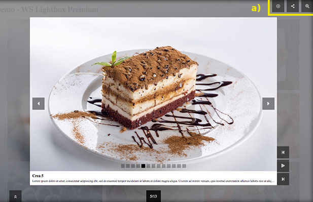
// b) example with stack
box_top_right_outside     : 'stack',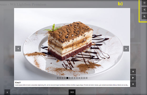
Buttons
You can customize the appearance of the buttons according to your style with the object buttons
// example a) :
buttons : {
    size : 30,
    style : 'square',
    color : 'black',
    color_icon : 'white',
    border_width : 0,
    border_color : 'white',
    opacity : .8,
    hover_opacity : 1
}
// example b) :
buttons: {
    size            : 35,
    style           : 'circle',
    color           : 'white',
    color_icon      : 'red',
    border_width    : 0,
    border_color    : '',
    opacity         : 1,
    hover_opacity   : 1
}
| Option name | Type | Description | Default value |
size | Integer | Sets the button size (value in pixel) | 30 |
style | String | Define the button style (accepted values : 'default', 'square', 'rounded' or 'circle') | 'square' |
color | String | Sets the button color (color name and hexadecimal accepted) | 'white' |
color_icon | String | Sets the color of the button icon (color name and hexadecimal accepted) | 'black' |
border_width | Integer | Sets the border width of the button (value in pixel) | 0 |
border_color | String | Sets the border color of the button (color name and hexadecimal accepted) | border_color |
opacity | Decimal | Sets the ratio of the button opacity | .8 |
hover_opacity | Decimal | Sets the ratio of the button opacity during the mouse hover | 1 |
Arrows
You can customize the appearance of the lightbox arrows according to your style with the object arrows
// example a) :
arrows : {
    position : 'outside',
    style : 'svelt',
    icon_style : 'caret',
    icon_size : 24,
    opacity : .2,
    hover_effect : 'translate',
    hover_opacity : .5
}
// example b) :
arrows : {
    position : 'inside',
    style : 'circle',
    icon_style : 'angle',
    icon_size : 24,
    opacity : .5,
    hover_effect : 'shrink',
    hover_opacity : 1
}
| Option name | Type | Description | Dafault value |
position | String | Defines the arrows position (accepted values : 'outside', 'inside' or 'attached') | 'outside' |
style | String | Defines the arrows style (accepted values : 'square', 'rounded', 'circle' or 'svelt') | 'svelt' |
icon_style | String | Defines the icon style of the arrows (accepted values : 'default', 'caret', 'angle' or 'chevron') | caret |
icon_size | Integer | Sets the icon size of the arrows (value in pixel) | 24 |
opacity | Decimal | Sets the ratio of the arrows opacity | .5 |
hover_effect | String | Defines the effect of the arrows during the mouse hover (accepted values : 'zoom', 'shrink' or 'translate') | 'translate' |
hover_opacity | Decimal | Sets the ratio of the arrows opacity during the mouse hover | .8 |
Dots
You can also customize the dots of the slider.
// example a) :
dots: {
    style         : 'square',
    size          : 15,
    spacing       : 3,
    color         : 'white',
    border_width  : 0,
    border_color  : '',
    opacity       : .3,
    hover_effect  : 'zoom',
    actived       : {
        color         : 'white',
        border_color  : '',
        opacity       : 1
    }
}
// example b) :
dots: {
    style         : 'rounded',
    size          : 20,
    spacing       : 5,
    color         : 'aliceblue',
    border_width  : 0,
    border_color  : '',
    opacity       : .3,
    hover_effect  : 'zoom',
    actived       : {
        color         : 'lightblue',
        border_color  : '',
        opacity       : 1
    }
}| Option name | Type | Description | Default Value |
style | String | Defines the dots style of the slider (accepted values : 'square', 'rounded' or 'circle') | 'square' |
size | Integer | Sets the dots size of the slider (value in pixel) | 6 |
spacing | Integer | Defines the space between each dots (value in pixel) | 3 |
color | String | Sets the dots color (color name and hexadecimal accepted) | 'black' |
border_width | Integer | Sets the border width of the slider dots (value in pixel) | 0 |
border_color | String | Sets the border color of the dots (color name and hexadecimal accepted) | '' |
opacity | Decimal | Sets the ratio of the dots opacity | .3 |
actived | Object | color (String) Sets the color of the actived dot (color name and hexadecimal accepted). Default Value : 'black'border_color (String) Sets the border color of the actived dot (color name and hexadecimal accepted). Default Value : ''opacity (Decimal) Sets the opacity ratio of the actived dot. Default Value : 1 |
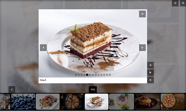
Selector
The selector allows you to see all the pictures present in the slider as thumbnails. When you click on one of the thumbnail it will select you directly the picture associated.
This selector is like a banner scrollable positionable at the bottom or the right of the screen.
The Banner selector
You can customize the appearance of the banner selector according to your style with the object selector
// example :
selector: {
    size          : 130,
    padding       : 5,
    margin        : 10,
    gap           : 5,
    bg_color      : 'black',
    border_color  : 'black',
    border_width  : 1,
    border_radius : 0,
    opacity       : .5,
    hover         : {
        border_color  : 'lightgrey',
        opacity       : .8
    },
    actived       : {
        border_color  : 'white',
        opacity       : 1
    }
},| Option name | Type | Description | Default value |
size | Integer | Sets the height of the banner selector (value in pixel) | 130 |
padding | Integer | Sets the padding top and bottom of the banner selector (value in pixel) | 5 |
margin | Integer | Sets the margin top and bottom of the banner selector (value in pixel) | 10 |
gap | Integer | Sets the gap between each thumbnails in the banner selector (value in pixel) | 5 |
bg_color | String | Defines the background color of the banner selector (color name and hexadecimal accepted) | 'black' |
border_color | String | Defines the border color of thumbnails (color name and hexadecimal accepted) | 'black' |
border_width | Integer | Sets the border width of the thumbnails (value in pixel) | 1 |
border_radius | Integer | Sets the border radius of the thumbnails (value in pixel) | 0 |
opacity | Decimal | Sets the ratio of the selector opacity | .5 |
hover | Object | border_color (String) Defines the border color during the mouse hover. Default value : 'lightgrey'opacity (Decimal) Sets the opacity of the banner selector. Default value : .8 | |
actived | Object | border_color (String) Defines the border color of the actived thumbnails. Default value : 'white'opacity (Decimal) Sets the opacity of the actived thumbnails. Default value : 1 |
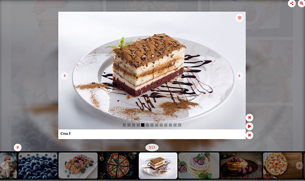
The selector arrows
The banner selector have his own arrows and can be customized separately of the lightbox arrows.
selector_arrows: {
    color         : 'black',
    color_icon    : 'white',
    style         : 'svelt',
    icon_style    : 'angle',
    icon_size     : 24,
    opacity       : .2,
    hover_effect  : 'translate',
    hover_opacity : .5
}| Option name | Type | Description | Default value |
color | String | Defines the color of the selector arrows (color name and hexadecimal accepted) | 'black' |
color_icon | String | Defines the icon color of the selector arrows (color name and hexadecimal accepted) | 'white' |
style | String | Defines the style of the selector arrows (accepted values : 'default', 'square', 'rounded', 'circle' or 'svelt') | 'svelt' |
icon_style | String | Defines the icon style of the selector arrows (accepted values : 'default', 'caret', 'angle' or 'chevron') | 'angle' |
icon_size | Integer | Sets the icon size of the selector arrows (value in pixel) | 24 |
opacity | Decimal | Sets the opacity of the selector arrows | .2 |
hover_effect | String | Defines the effect of the selector arrows during the mouse hover (accepted values : 'zoom', 'shrink' or 'translate') | 'translate' |
hover_opacity | Decimal | Sets the opacity of the selector arrows during the mouse hover | .5 |
Social networks
The social_networks object allows you to share your media on the social networks (twitter, facebook and pinterest).
This object contains an option domain to determinate your website link and 3 objects : twitter, facebook and pinterest.
This 3 objects allow you to customize the social networks buttons individually.
// example :
social_networks : {
    domain       : 'https://my-domain.com',
    twitter  : {
        username      : 'Walker Spider',
        color         : '#55acee',
        icon          : 'fab fa-twitter',
        color_icon    : 'white'
    },
    facebook : {
        color         : '',
        icon          : 'fab fa-facebook-f',
        color_icon    : '#3b5998'
    },
    pinterest : {
        color         : '',
        icon          : 'fab fa-pinterest',
        color_icon    : '#bd081c'
    }
}| Option name | Type | Description | Default value |
domain | String | Sets the link of your website | 'https://example.com' |
Twitter (Object)
| Option name | Type | Description | Default value |
username | (String) | Defines the username of your twitter account | 'Walker Spider' |
color | (String) | Defines the color of the button (override the buttons settings) | '#55acee' |
icon | (String) | Defines the icon (from a class of the fontawesome library) | 'fab fa-twitter' |
color_icon | (String) | Defines the icon color of the button | 'white' |
Facebook (Object)
| Option name | Type | Description | Default value |
color | (String) | Defines the color of the button (override the buttons settings) | '' |
icon | (String) | Defines the icon (from a class of the fontawesome library) | 'fab fa-facebook-f' |
color_icon | (String) | Defines the icon color of the button | '#3b5998' |
Pinterest (Object)
| Option name | Type | Description | Default value |
color | (String) | Defines the color of the button (override the buttons settings) | '' |
icon | (String) | Defines the icon (from a class of the fontawesome library) | 'fab fa-pinterest' |
color_icon | (String) | Defines the icon color of the button | '#bd081c' |
Background & image
Background
You can customize the background lightbox with a filter and an opacity.
The filter option can be a color or be setted to 'image' if we want to get the current image selected as a blur background.
// example with background image :
background : {
    filter  : 'image',
    opacity : .8
}
// example with background color :
background : {
    filter  : 'aquamarine',
    opacity : 1
}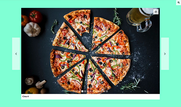
| Option name | Type | Description | Default value |
filter | String | Sets the background of the lightbox (accepted values : the color names, the hexadecimal and 'image' | 'image' |
opacity | Decimal | Sets the opacity background of the lightbox. | .5 |
Image
The lightbox image can be customize with border options and you can set a background with the option bg.
This background will can be viewed during the transition.
// example a) :
image : {
    border_radius : 10,
    border_color  : '',
    border_width  : 0,
    bg            : ''
},
// example b) :
image : {
    border_radius : 0,
    border_color  : 'aquamarine',
    border_width  : 2,
    bg            : ''
}
| Option name | Type | Description | Default value |
border_radius | Integer | Sets the border radius of the image (value in pixel) | 0 |
border_color | String | Sets the border color of the image | '' |
border_width | Integer | Sets the border width of the image (value in pixel) | 0 |
bg | String | Sets the background of the image (can be viewed during the transition) | '' |
Velocity
You can customize different speeds animations of the application : the display of the lightbox with the option display_velocity, the slide animation with slide_velocity and the autoplay with autoplay_velocity.
This options accept an integer value (in ms) or a string : 'low' , 'normal' or 'fast'.
// exmaple :
velocities : {
    display_velocity  : 'low',
    slide_velocity    : 'normal',
    autoplay_velocity : 'normal'
}| Option name | Type | Description | Default value |
display_velocity | String or Integer | Sets the speed of the displaay animation (accepted value : integer, low (equivalent to 800ms), normal (equivalent to 400ms) or fast (equivalent to 200ms) | 'low' |
slide_velocity | String or Integer | Sets the speed of slide animation (accepted value : integer, low (equivalent to 800ms), normal (equivalent to 400ms) or fast (equivalent to 200ms) | 'normal' |
autoplay_velocity | String or Integer | Sets the speed of autoplay slide animation (accepted value : integer, low (equivalent to 8000ms), normal (equivalent to 4000ms) or fast (equivalent to 1000ms) | 'normal' |